AJS Furniture
AJS Furniture
AJS Furniture
Choosing wall panels and flooring together can make a room feel calm, bright, or unexpectedly crowded. The question, “How to match wall panels with flooring colors,” is not answered by color charts alone. Wood grain, panel finish, room light, and the size of each surface all affect the result. Start with what is already fixed. Existing flooring may not be easy to change, and that matters.
For a balanced scheme, compare samples in the actual room, not only under showroom lighting. Place a panel sample beside the floor, then check it near a window and after dark. Light changes everything. A warm oak floor may pair well with cream, muted green, or deeper walnut panels. Cool gray flooring often suits soft whites and restrained charcoal. Still, undertones can surprise you. Glossy surfaces reflect light differently from matte finishes, so one small sample may not tell the whole story. Test it twice.
The ideas below explain seven practical ways to coordinate tone, contrast, texture, and visual scale. They are useful starting points, not rigid rules; homes have different daylight, furniture, and personal priorities. Color matching can also become too precise: when every surface shares the same shade, the room may feel flat. A little contrast often helps. These tips consider transitions, such as doorways and narrow halls, where abrupt color shifts stand out. Careful testing can create a connected look without making the room feel overly coordinated.
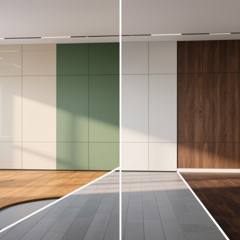
7 Best Ways to Match Wall Panels with Flooring Colors
Identify the undertones before comparing the main colors. Wall panels and flooring may look beige, gray, or brown, yet contain hidden yellow, red, blue, or green tones. These undertones often determine whether a room feels balanced or strangely mismatched. I have seen a pale gray panel look blue beside warm oak flooring. The problem was not the shade. It was the undertone.
View large samples beside each other, not separately. Place them near a window, under ceiling lights, and in a shaded corner. Natural light can reveal warm or cool shifts that showroom lighting hides. Check the samples at different times of day. Morning light may soften yellow tones, while evening light can make warm flooring look stronger. Small samples mislead.
Look at permanent features too. A stone hearth, metal trim, or existing furniture may emphasize an undertone. Warm flooring usually works with panels containing cream, tan, or muted brown notes. Cool flooring often pairs better with blue-gray, soft white, or charcoal notes. Neutral undertones offer flexibility, but they can appear flat without texture. This is where I sometimes revise my first choice. A technically correct match may still feel lifeless in the room. If two samples compete, separate them with a neutral transition, such as a light rug or painted trim. Leave the samples in place for at least one full day before deciding.
Not necessarily. Repeat an undertone, such as warm oak, but vary the shade or texture. Exact matches can make a room feel flat.
Pair dark flooring with lighter panels to reduce visual weight. Keep trim and ceilings light if both surfaces are rich. Too much contrast may feel harsh.
View large samples in morning, afternoon, and evening light. Leave them beside the floor for several days. First impressions can change after sunset.
Warm beige beside cool gray can look muddy. Check the samples side by side, then step back and view them from the doorway.
Pair ribbed panels with smoother flooring, or use one strong pattern and keep the other surface quiet. Two bold patterns can overwhelm a large wall.
Yes. Glossy panels reflect window light, while matte surfaces can soften uneven lighting. A warm sample may look too yellow at home. I learned that late.
Try a pale rug, warm lighting, or natural-textured furnishings. A small adjustment may help more than adding another color.
Vertical lines can make a ceiling seem higher. Wide horizontal patterns may make a narrow space feel calmer, though the effect depends on the room.
How to match wall panels with flooring colors begins with understanding their undertones. Compare whether each surface leans warm, cool, or neutral, then choose shades that share a similar direction or create a deliberate contrast. Balance light and dark tones to keep the room from feeling either flat or overly heavy; for example, lighter flooring can brighten deeper panels, while darker floors can ground pale walls.
Color is only part of the pairing. Consider how the panels’ finish and texture relate to the flooring, and account for the room’s natural and artificial lighting, which can change how colors appear. Before making a final choice, place samples together in the actual space and view them at different times of day. This helps reveal whether the combination feels cohesive and balanced in the room itself.